Wednesday, October 26, 2011
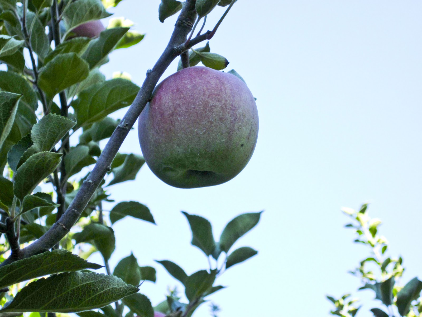
Carter’s Mountain Elements of Art and Principle of Design
The elements of art are line,shape,form,color,texture,and space. The principles of design are rhythm & movement,balance,proportion,variety,emphasis,unity. I used the adjustment brush in Camer RAW to highlight and brighten most if not certainly all of the elements of are and principles of design. #swag
Wednesday, October 19, 2011
Spooky Picture
This is a spooky picture that I made of my good pal Alex. At first he was spooky, LOLZ, and then I made him even more spookier, LOLZ. I used the burn tooool and the eye changing color tutorial. I threw in a vingette to really set the mood. Last, I put that scary shadow in from Insidious-TM, becasuse afterall it is a spooky picture. Am I right?
Tuesday, October 11, 2011
Friday, September 23, 2011
Thursday, September 22, 2011
9/11 Commemoration
This is a project our class made in honor of remebering 9/11. It is a class that collage and everyone chipped in on it. I did indeed like working as a group to make this project. It got a good perspective from everyone viewpoint of what they think 9/11 is.
Tuesday, September 13, 2011
Cameraw!
These are pictures that I found online obviously taken and edited by a professional. They were all edited in cameraw! Some are artistic some realistic and one is black and white. The very last picture is by far my favorite out of all of them.
Friday, September 9, 2011
Balance collage
This was the balance collage. My first masterpiece is asymmetrical and is advertisement for the oh so delicous honey bunches of oats cereal. My second work of art is radial, and it really just describes what inspires me deep down. The later of my three compositons is symmetrical and it shows me past, present, and in the future.
-future me
Monday, August 29, 2011
Image review
This was an image review that I made. Its basically a collage using ten or more photos. I used a lot of layer masks to make items kind of look like they belong there. The grass and the people holding the picture are examples. I also used the blur tool. Lastly I changed the color of the leaves using layer adjustments. The leaves arent all that good, but I tried my hardest. Thats all that counts.
Thursday, January 13, 2011
Videos
These videos are 10 of my best pieces of work. Also 10 of my favorite pieces of work of my pal Matt Stuart
Portraits
These are portraits that I took in class. One I used props, out of my comfort zone by jumping, and the last was a really nice close up on my stunning hand. I made all of these pictures look really snazzy in camera raw. Thank you.
Type Self Portrait
I took a picture of me then put a lot of words that are the same color on my clothes and body. This was probably the hardest project I have ever done, but it is also one of the best. Bye
Scanography
I put these two items and this picture of me as a small infant on a scanner. It proceeded to go "vroom", "vroom" then they were on the computer.
Monday, January 3, 2011
Out of proportion
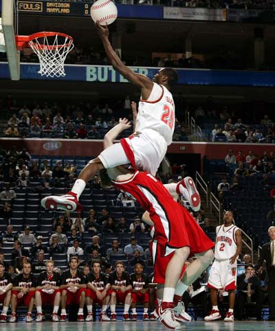
I made this image by replacing the basketball with a baseball. Its totally bigger than it should be. I would even dare to say thats its "out of proportion". Don't you love it when they say the title of the movie in the movie. I just did that. Your welcome.
Poster
This is a poster that I made for the Fine arts festival. It took first and second place. But im sorry to say it couldn't get the bronze.
Clear skin
I made this nice woman of asian heritage have very nice skin. I used the blur tool and some filters to make it look this clear. I also lowered the opacity. She might be of chinese decent or perhaps korean...north or south. Thank you
Subscribe to:
Posts (Atom)